Friday, September 2, 2016

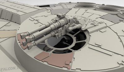
Quad Laser Cannons

According to the Haynes Manual The Millennium Falcon is equipped with two CEC AG-2G quad laser cannons.  The first was installed by Lando and the second by Han.
There's no other way to say it; the Millennium Falcon's guns are confusing.  The first time they were used on screen was in A New Hope after the ship fled the Death Star pursued by a squadron of Tie Fighters.  Han ascends up a ladder to the dorsal gunpit...
 followed by Luke who descends to the ventral gunpit.
They sit in the gunpits perpendicular to the rest of the ship, with the ladder on the floor behind them.  Since we know what the exterior of the ship looks like, we know that their feet are facing in the forward direction.  This is in opposition of the gravity of the rest of the ship, but we'll give them a pass since these ships have to have artificial gravity anyway.
Where this starts to fall apart is when you look at the side view of the ship and see that there's no way both gunpits AND a tube with a ladder in it would never fit inside the ship.
Anyway, they sit in the gunpits looking out the top and bottom of the ship with the quad laser cannons hanging in front of the window from above.
The quad laser cannon is mounted on a gimbal fork which allows it to rotate in almost every direction.
It's important to note the use of a targeting computer in this scene because despite the range of motion of the quad laser cannon the visibility from the gunpit is just terrible.
Han and Luke manage to take out all of the Tie Fighters and the Millennium Falcon continues on to Yavin.  We don't see the gunpits in action again until The Force Awakens (apart from the deleted scenes from Return of the Jedi, which would have been awesome!)
Finn and Rey enter the Millennium Falcon on Jakku and Finn climbs down the ladder to the ventral gunpit (why he wouldn't go to the dorsal gunpit I'll never understand).
He gets down to the gunpit and sits in the chair and the quad laser cannon is now sticking up in front of the window from below his feet.
So why the difference?  WELL... we know that the tube that leads to the gunpits is opposite the corridor that leads to the cockpit and because of that facing the ladder means facing the center of the ship.  Since the quad laser cannons are mounted at the center of the ship and the ladder is behind the gunners' chairs at their feet then it makes sense that the gun mount would also be at their feet.  There's also the matter of the cockpit tube being at a 60 degree angle from the center of the ship though; to make sense of that the core caps in The Force Awakens have the ability to rotate!  While we don't see it happen explicitly, the evidence is there.  Just look at these two shots.  The core caps do a 180!
The diagram below shows how The Force Awakens made sense of the Falcon's guns.  The rotation of the core caps is explained in The Force Awakens Cross Sections book as a refurbishment by the gunrunner Gannis Ducain, so this is an addition made after the original trilogy.
This solution makes sense to me, but I have to say I don't like it!  To have such a large piece of the ship rotating seems mechanically infeasible.  The gimbal fork allows the quad laser cannons to face any direction, so there's no need for any core rotation, but even if the core could rotate, the access tube binds them together so the gunners would be forced to rotate in the same direction.  This seems to me like a tactical disadvantage in a dogfight.  There's also this shot from The Force Awakens:
This seems to suggest that the core caps aren't connected in any way... but we always see the tube behind the gunners.  The guns are inexplicably facing forward again in the very next shot:
It hurts my brain!  I do appreciate the effort to make the design work, but my solution to this problem would probably be something more like what is illustrated in the Haynes Manual, an angled hallway that leads to the gunpit.  That of course would mean a redesign of the set, which I suppose would be more noticeable.
At the end of the day though...  why even try to solve the problem?  The Millennium Falcon is a physical impossibility in many ways.  No two Falcon models are alike, no two sets are the same, and no combination of either fits together perfectly, but when watching it on film none of that matters.  I love the gunpit scenes in both A New Hope and The Force Awakens because they're exciting and I love to see the Falcon in action.  As I write this I am in progress on modeling an interior that doesn't fit whatsoever with the exterior of the ship, and that is just fine by me!

If you've made it this far, you're awesome!  I'm sorry if this post became too much of a nerd rant!

Next time: a primer on greeblies!

Wednesday, August 24, 2016

Engines

The Millennium Falcon's engines are part of what makes the ship really unique to me.  We've all seen the typical rocket engines and jet engines before, but the Falcon is really one of the few ships in Star Wars (and really anywhere else) that has something different; a strip that covers a quarter of the rear of the ship and is really more radial than directional.  This design has definitely evolved and become more fleshed out over the years, and of course it wouldn't be the Falcon if any two versions of it were totally alike!
Originally the 5 foot filming model built for A New Hope had engines that were a strip of frosted glass that was back-lit.
While this was super effective in the original trilogy's theatrical release as the ship flew by camera on film, we hadn't really seen what the Falcon's engines looked like powered down.  The special editions in the late 90s expanded on the design with this shot of the Falcon blasting its way out of Mos Eisley Spaceport:

I was 11 years old when I first saw this shot and I remember being absolutely amazed by it.  I had never even considered what might be behind the bright light that was the Falcon's engines.  I definitely think of that moment as a turning point for me because from then on, I was completely fascinated by the inner workings of spaceships.
Eventually more designs started to surface.  The DK cutaway books from the 90s were books I stared at for hours at a time throughout my young adulthood and the Falcon cutaway depicts the engines like this:
Several years later The Haynes Manual offered this diagram:
While I don't wholly agree with what these artists have done with the ship, what I love about these two books is that artistic license was taken to make practical sense of things.  I had never thought of it as a small child but when I read the cutaway book for the first time I remember thinking, "Of course the engines would need thrust vector plates, and of course they would need to be thick for the amount of thrust the Falcon would generate."  These were formative experiences to be sure.  I know now that the flaps on the filming miniatures don't even have any separation between them.
Contrary to what I saw in these books, I always felt that the Falcon's engines needed to occupy more space on the inside of the ship.  On the top of the engine deck are six massive cooling fans, so in my opinion what lies beneath has to warrant a need for them.  I'll talk more about the Falcon interior later, but what I ended up building in terms of the basic shape of the exhaust manifold and the flaps is a combination of what I saw in these two books.  The pistons on top of the flaps were built from reference of the 5 foot filming miniature.  Here's a close up of one engine section:
And here's an animated breakdown of the various engine parts:
One of the joys of being a 3D modeler and building something modular like the Falcon's engines is that you only need to build one piece and then duplicate it around.  Building these sections early on was really satisfying because it covered such a large area of the ship and started to give me an idea of the scale of details to come.
That's all I have to say about the model this week, but I did have fun exploring what the engines would look like powered up.  In Keyshot I was able to get a pretty cool looking result in a pretty short amount of time (I did add a bit of a glow in Photoshop though.)  Without further adieu, let's kick the tires and light the fires!

As always, thanks for reading!  Next time: Quad Cannons!

Wednesday, August 17, 2016

Boarding Ramp

I had a lot of fun modeling the boarding ramp.  It was one of the first things I tackled because it was featured in the Star Wars: The Blueprints book as shown:
This drawing is of the set from The Empire Strikes Back and as I mentioned before, because of its massive size, this set was scaled down.  What I've modeled is slightly larger than this so no one has to duck to board the ship (except maybe Chewie, but I don't think they had Wookiees in mind when they designed her.)  One of the things I like about this drawing is the notch cut out of the corner so the ramp can rest on the ground.  This is something that exists on every set but on none of the filming miniatures.
Shortly after building the parts I began playing around with animation and I realized something.  The ramp has to get longer as it lowers.
The blueprint drawing shows that the pivot point of the ramp is where the outer surface of it meets the surface of the docking tunnel, but when I rotated my ramp in maya I noticed that the lowered ramp was shorter than it appeared in the drawing.  Also the drawing shows the struts lowering straight down through a narrow channel, but the distance between the pivot points changes in the raised and lowered positions.  My solution was to build ramp parts that slide (similar to a full extension drawer slide) in order to properly extend the ramp.  It's difficult to see here, but this is my final animation (with bonus landing gear!)
Here's a view up the ramp.  The geometry back there is not detailed whatsoever.  I'm currently working on modeling the interior and eventually I will be adding detail to this section.
The last thing I want to mention today is really more of a tease for a later post, but it's something I noticed right away and I find it pretty amusing.
The Falcon interior set's floorplan is always shown as being flat, but the Hans in this image show a 3 foot distance between where the floor is defined in the ramp schematics and the floor of the cockpit.  The ship of riddles strikes again!

Next week:  Engines!

Wednesday, August 10, 2016

Landing Gear

One of the first things I modeled was the Falcon's landing gear, mainly because these great blueprints are available online.
I decided to model my Falcon with 5 sets of landing gear.  In A New Hope the Falcon model and set were built with 3, as you can see in these images, (first a screengrab of the ANH set, second an image from RPF user Jaitea's Millennium Falcon Differences thread)

Two additional landing gear boxes were added for The Empire Strikes Back, presumably to better support the weight of the full Millennium Falcon set.  Some write this change off as some of Han's "special modifications."  I always preferred the look of the landing gear box configuration from ESB because it seemed like a more balanced design.  To me it looked goofy with the big box on the back and nothing up front.  Needless to say I wanted my model to have the two forward landing gear boxes.
Here is a quick animation test of the landing gear deploying and retracting:
The way the doors open was something I had a lot of fun figuring out.  I knew the doors on the set were cut into thirds with notched edges on the panels.  You can see in this screen grab that 2 of the 3 fold up on themselves with the help of some pistons.
I also referred to this image from the Haynes Manual on how to construct the door mechanisms.  (Note the difference in scale between the ships in these two images...  not even close!)
The thing that bothers me about the Falcon's landing gear design is there is an implication that they are like shock absorbers that can collapse into the hull of the ship, but the big blocky elements don't allow for very much compression.  The bays I had to extrude into the landing gear boxes were really cavernous to accommodate the gear. Also, in order to make the landing gear reach both the ground and the ceiling of the landing gear bays I had to make the struts so long that they stuck out of the top of the ship when fully retracted. (One of the landing gear bays totally intersects with the cockpit tube, but we'll get into interior v. exterior discrepancies later!)  You can see my solution to these problems in the animation; landing gear bay ceilings that move down with the landing gear.  This animation is not without it's flaws though.  You can see on the aft landing gear there is a small piston that materializes through the ceiling.  I will work harder to figure all of these things out when I do the animation rig.
The Falcon's landing gear is always depicted in the sets and matte paintings as having hoses hanging down alongside the landing gear.  I haven't included them with my landing gear because I feel like they would get caught and/or damaged by the mechanism.  That being said, I do think they add a certain extra level of detail and scale so they may be something I add later.

As always, thank you for reading!  Next time: The Boarding Ramp!

Wednesday, July 27, 2016

Armor Plating

The "paneled spaceship" look is a staple of the Star Wars aesthetic.    The filming miniatures are covered with sheets of styrene and the sets with 3/4 inch plywood.  Within the Star Wars universe the Millennium Falcon is almost completely covered with "durasteel and duralloy" armor plating.  I initially decided I wanted my armor plating to be substantial enough to withstand the laser blasts and asteroid hits that occur in the movies and started by making panels that were a full inch thick.  I ultimately found that anything more than 3/4 of an inch felt too thick.  For all intents and purposes, the thickness of my armor plating matches the set.
Before I go any further into the build though I'd like to talk a bit about my modeling process.  For those who don't know much about polygon modeling, this video explains it in very basic terms.  The problem with polygon edges is that they are mathematically perfect, which is to say more perfect than anything that exists in the real world.  Even the edge of a knife has a radius that will catch light.  The way to create these radii in cg is to simply add more polygons and/or subdivide the mesh at render time.  When I started this build I knew the resulting model would have a very heavy polycount and could take a long time to render.  Since my goal for this model is VR, which renders in real time, I knew I had to find a better way.  Video games render in real time and get around the problem of heavy geometry by using textures (specifically normal maps) to make very light and optimized geometry look like it has the resolution of a denser mesh.  Before deciding what to do I put together this test in maya using various techniques to achieve my desired panel look.  The ultimate goal was a model that was light as it could be while still looking good.
I decided to make my geometry minimal and use the mental ray round corners shader to simulate the look of a radius on extremely light geometry.  The renders I've been showing so far are from Keyshot, which has a similar effect, but here's a closeup of the effect in a maya/mental ray render (and a sneak preview!)
The other interesting thing this shader creates is a radius at geometry intersections.  It almost makes it look to me like everything has a thick coat of paint on it, which is kind of what I want in this case.  All this is a bump mapping trick, but I think from a certain distance it works extremely well.  The plan is to bake the effect down to a texture map when I do the final paint job.  

Anyway, enough technical nonsense!

While it's only been a week since my last post, modeling these panels took a lot of time and required a lot of reference.  If you search for images of the Millennium Falcon you'll find endless variations of the Falcon's panel layout.  The differences between the 5 foot and 3 foot filming miniatures is partially to blame.  In this thread RPF user Jaitea has explored some of these differences.
While modeling my panels, I had fantastic reference of the top of the 5 foot filming miniature thanks to the photogrammetry work by RPF user vfxsup64 in this thread (these images were instrumental in figuring out the scale of some of the greebles later on).

What I didn't have was good reference of the bottom.  I did however have the blueprint drawing of the bottom panel layout of the set (half of it anyway).
Comparing that against my photo reference I found this panel layout and the 5 foot filming miniature for that side to be fairly close.  The rest I simply eyeballed from photo reference.  Since my model was already an idealized mishmash from several sources of reference I decided I couldn't be too precious about it matching exactly.  Later when I uncovered better reference of the bottom I found that I was pretty close.  (Bear in mind this bottom view predates the forward landing gear boxes which were added for The Empire Strikes Back.)

Something else I wanted to mention is that the Falcon's panels all have notched edges which I always thought added a nice level of complexity to the partlines.  On the filming miniature a device called a nibbler was used to achieve this look.  I used a similar workflow with booleans in maya.  In addition to the large panels, the Falcon is covered with small patch panels I like to call chiclets.  I included them with this post because the workflow and reference I used to make them is the same.

I hope you guys enjoyed and maybe learned something.  As always, I welcome any questions or comments!

Next time: Landing Gear!

Wednesday, July 20, 2016

Terminology

Before I post more progress I'd like to do a mini post about Millennium Falcon naming conventions I will be using.  Nautical terminology provides a standard for describing direction.  I've put together this image to illustrate these terms and their meaning: 
The following diagram illustrates standard naming conventions for the different parts of the Falcon.  I've referenced Robert Brown's Ship of Riddles site for these terms.
That's all for now!  I highly recommend further exploration of Robert Brown's site;  it's full of great information on the Falcon and poses some interesting solutions to the ships design conundrums.